I like the intro to the Ray-Ban website. Really colourful and fun, plus it goes with their new colection of colour-rimmed sunglasses. A cute touch was the "feed the chameleon" once you enter the site. really random, i cant imagine where they got the idea from.
http://www.ray-ban.com/UK/
Tuesday 6 October 2009
Bahrain National Museum

After not having visited the place since i was a kid, I decided to go back to the Bahrain museum this summer hoping to get a few useful references for my dissertation or independent project. i ended up going around the whole museum, looking at the different displays.
The museum is the largest and one of the oldest museums in the country. It has a collection of Bahrain's ancient archeological artifacts, and covers 6000 years of Bahrain's history. It has three halls displaying archaeology and the ancient civilization of the country, and two other halls show the culture and lifestyle of Bahrain's recent pre-industrial past. This part i enjoyed the most. It had displays representing many different and important part of the old culture of Bahrain. Its perfect for tourists (not that there are many) to understand the countries past and its heritage and culture. It'd also be good reference for coming generations, who would have probably not known about these aspects of their heritage (not that i think many of them would come to the museum).
There is also a collection of old Quranic manuscripts, notes on astronomy and historical documents at the Documents and Manuscripts Hall. Finally, a section for current artists to display their works, but i didn't like the exhibition so much at the time that i went.
Brand Associates
A website i love bye a graphic design company in Bahrain. I love how it goes off the page and then zooms back into the section you want. It's not easy to follow any you mite need a bit more patience then you want to have for a site, but it shows that the company has got the creativity and skills.
http://www.brandassociates.org/welcome.html
http://www.brandassociates.org/welcome.html
Eat Pray Love
 Another book I read over the summer, this one however wasn't as great as the others. Don't get me wrong, I can't deny the book's success. It's a good book and I do think i gained something from it. It just wasn't one of those i couldn't put down, or couldn't wait to get back to reading. I thought it was a little slow, and didn't have a strong climax, or maybe it did but happend towards the end.
The story is a memoir about the author who goes through a journey of self discovery after a messy divorce followed by depression. She spends a year traveling through 3 countries; she eats and enjoys life in Italy, then India where she tries to find her spirituality, and finnaly Indonesia where she falls in love.
I did like the book, and im glad i read it. i just didn't love it. i didn't keep me on my toes, as they say. I do like the cover design though. It's really sweet and simple. Maybe a little obvious.. but i don't mind so much. Not only is the typography choice relevant, but the style and simplicity of it. It also reminded me of our typography/phobias project.
Blackberry vs. iphone
The two phones have become the most popular ones at the moment and are competing really strongly. The response by apple is great, even the sounds and music is really effective. Although i think the iphone is a much cooler phone, the blackberry seems to be winning the battle in terms of sales, all due to the blackberry messenger which allows you to messege, send pictures and voice-clips to other blackberry owners for free.
Kafka on the Shore
 I'm still half way through reading this book, but unfortunately the deadline for this blog is soon and i just had to post it. The reason is that it might be one of the strangest books i've ever come across. it's japanese written in 2002 and was translated into english in 2005. unlike other translated books i've read, the language doesn't seem to have lost its quality through the translation. obviously i don't know how it was in japanese, but i was surprised to see the strong style of writing and language. it actually won some sort of translation award.
The story so far goes like this:
There are two different plots, the narrative runs back and forth between the two, every other chapter is about 1 of them. All the odd chapters are about 15 year old Kafka's story as he runs away from his father's house. After a series of adventures, he lives and works at a private library. There he spends most of his days reading.
The even chapters tell Nakata's story, who is an unintelligent old man who speaks to cats, and is because of this, earns money by finding peoples lost pet cats. Then, the case of one particular lost cat puts him on a path that ultimately takes him far away from his home, ending up on the road for the first time in his life. I think his and Kafka's stories are going to meet soon.
It's a great book so far, weird and so full of surprises. Because of the 2 different stories on every other chapter, you can't put it down. i love the creativity of the plot line and style, as well as the fantasy in it,
Louboutins

Christian Louboutin is a footwear designer. Since 1992, his designs have incorporated the shiny, red-lacquered soles that have become his signature. I'll admit it's very "girly" of me to be posting this on my blog in my Design category, but to me Louboutin shoes is one of the greatest pieces of art in the fashion world today. It's so interesting that just the addition of 1 colour, changed the whole look of the shoe. Apparently Louboutin's goal is to “make a woman look sexy, beautiful, to make her legs look as long as he can”. To be honest i don't think I've ever seen sexier shoes than his. The history behind the red soles is that while Christian was working on a prototype of his design in Paris, he loved the color of red nail polish someone was using near him. He quietly put this color on his shoe and ..just with that.. he created fashion history. At some point he thought to use different colors on all his designs, but when he saw how the red looked he knew that it was it. By just adding the 1 colour on the bottom of his shoes, he turned them from any other designer footwear to icon pieces that can be spotted from a mile away. I also really like his logo. it completely suits the whole brand identity, its so classy and french, and i think its timeless. i dont think a logo like that would go out of style, for designer shoes.
I went on the website, and like many other designer brands' sites, it was really cool and properly developed to be completely relevant to the brand image. I love how the image of the shoes walks up to whatever you clicked. the sound effects for that and for the intro of the site makes it more interesting. Some parts of it are quite wacky and weird, but still very relevant.
http://www.christianlouboutin.com/

Monday 5 October 2009
Wayne Thiebaud

Thiebaud's composition is pretty normal and typical, but i like the way he uses colour and shading. In his painting of the gum-ball machine for example, he uses clear lines to show different shades. Also, he makes the shadow in orange, which makes the piece different and interesting. He often uses light, soft colours, lighter than the colours most modern artists use. It makes his piece unique within the era. There's something about his pieces that I find cheerful and funny. It's mainly to do with his style, his images, and his choice of colours.
Rosenquist

I think what i like most about Rosenquist is the creativity of his composition. Sometimes it's not easy to figure out his paintings, just at first. They are mostly of just random things of our popular culture put together to create an image. I also love his way of shading and blending colors together to make the images so realistic. These are both elements that make the artist a useful reference. Rosenquist was a billboard painter which is interesting but not surprising at all. His style is very suited for advertisements i think. Through his painting, Rosenquist seems to discuss the theme of popular culture and is one of the leaders of the american pop art movement.
Sunday 4 October 2009
Modern art in arabic culture

Part of the research for my independent project is going to be the subject of modern arabic art, so i thought I might as well get a general idea early on.
The arabic culture has gone through many rapid transformations over the past few decades, and the infusion between western and eastern culture in Arab countries is evident in their every day life. These major changes are what gave rise to postmodernism in Arabic art, as well as a change in the style of arabic artists. They have moved away from the earlier style of displaying images of the environment, nature and of culture representations, which in my opinion have become very typical and boring. The western influence is evident where many paintings have become more abstract forms of expressions. They seem to have many references and influences, which opposes the more individualistic art of the past where influences and references were very little and much more local. Artists have also come to use different and more developed techniques and materials such as electronic technology, installation, video, photographs, sculpture and performance. The ethnic and religious culture has provided arab artists with rich and complex references as well as opinions. These artists seem to have strong but sometimes conflicting views on the meaning of post modernism.
African Art
 African art may not be very popular and has been understudied, but the culture offers important contributions in the art world, and has been influential to the west. The history of African art dates back before recorded history, from rock art 6000 years ago in Niger, to the art in ancient Egyptian artifacts. African art has often been abstract and was an influence on many western artists in the 20th century such as Picasso, Modigliani, and Van Gogh. You could say it has an unconventional way of expression that often reflected imagination, emotion, mystical and religious experience. These and many other aspects of African art contributed to the sudden interest in abstract art.
Africa's long contriversial history must have influenced their artists into exploring many themes. They share many themes such as utility, where artists make use of objects and materials available to them to convey meaning. They'd represent issues such as social structure, status, or gender identity. A common medium used in African art is sculpture. It's noticable that much of their art is "3D". Also, through my research i noticed that many of the works seem to have multiple meaning where symbols and forms could reflect different things to different people.
Edward Hopper

Edward hopper may be the best known American realist of the interwar period. However, he was not always popular through his life, and was only properly realized since his death. He explores themes such as solitude and introspection through his work. His paintings always seem to reflect loneliness and isolation. He often painted public places, but with very few people, if any, and there is never a crowd. Loneliness is evident in the characters in his pieces in every aspect such as face expression and body language. Also, there is hardly ever an interaction of any kind between the people in his paintings.
Hoppers style seems to consist of realism, and an anticipation of pop art. He draws things they way they are, exactly how they are seen. A lack of creation and imagination is evident. He uses dull and very mellow colours. All these elements make his paintings less interesting. However, they are all significant to his style as they contribute to his themes. His compositions are realist, but may be symbolic in some respect. His theme of loneliness interests me, as well as his view of such an empty isolated world.
Saturday 3 October 2009
Cindy Sherman says:
"When I'm making the work I'm never thinking of any of the things people find in it. Sometimes I wonder if it's all a lot of crap. Maybe the work doesn't mean anything. When they're writing about it they're just finding whatever to attach their theories to. I just happen to illustrate some theories."
I quoted Cindy Sherman because I think what she said in those few sentances is so significant to us as artists. When I read it i thought FINALLY! Finally an artists that straight-forwardly admits this. As an art student I always was made to believe that the more "meaning" there is to piece, the better it is. And sometimes I find myself struggling whether or not to add meaning and how would i go about doing so. And then here it is.. Cindy Sherman, who has been an influential part of modern art, tells us that actually, people are going to find meaning anyways. They might even make it up. Just like people do with everything really, desperately scrambling for meaning everywhere. You come across other successful artists as well, like Micheal Craig-Martin, who claims his pieces have no meaning. It makes me think, is it meaning that makes a piece of work successful? or could it be purely aesthetics? I guess we all settled with this a long time ago, art is whatever. anything everything. whatever. So.. is it settled? are you most likely going to be a successful artist.. by chance? Surely not.. right? Now Cindy Sherman's pieces have become really expensive. In 1999 the average selling price for one of her photographs was $20,000 to $50,000, then the same year one of the photographs from Film Stills sold for a reported $190,000. And The Museum of Modern art bought the complete set from Film Stills for one million dollars.
Cindy Sherman gave a rise in photography, proving that it is infact a form of art. In many of her works she mocks stereotypes of women in society. In some of her filmstills she captures very typical and cliche images of women. You can tell that she is portraying these negatively through the face expressions in the photographs. She mostly uses herself in her works as a model or actress.

Michael Craig-Martin

Michael Craig-Martin is a contemporary pop artist, mostly famous for his piece "Oak Tree". Many of his pieces consist of elements or objects of modern society. These are usually random objects put together. He also uses vibrant and bright colours to emphasize shapes and sizes. One aspect that is different about the artist is that his pieces claim to have no or little meaning. He simply draws objects relevant and essential in our everyday modern life. His techniques are a useful reference especially in terms of color and style, as they make his pieces eye-catching for the viewer.
I find that his composition is another element the differentiates him. He has an interesting approach into organizing his pieces and displaying the different objects. His works are very similar to each other, and if it wasn't for his interesting use of composition and colour they may become too repetitive and boring. Another thing i like about his work is his manipulation of size. Usually all the objects in a piece are almost the same size, so that for example a sharpener is the same size as a fire extinguisher. It's also interesting the way he flattens and simplifies objects, into their most basic forms.
http://www.michaelcraig-martin.com/
"If you dare"
http://www.myspace.com/christophniemann
This is Christoph Niemann's myspace. Bet you can't stay on it for more than 5 seconds! I thought it was really cool, even though I don't think anyone would be able to go through it, but its an example of how an artist can turn everything that's theirs into art, and can express themselves in everything they make, even something as standard and simple as myspace
This is Christoph Niemann's myspace. Bet you can't stay on it for more than 5 seconds! I thought it was really cool, even though I don't think anyone would be able to go through it, but its an example of how an artist can turn everything that's theirs into art, and can express themselves in everything they make, even something as standard and simple as myspace
100% Evil

100% Evil is a book by Christoph Niemann and Nicholas Blenchman. It is illustration based book where both artists made illustration of random "evil things" using pen and ink. Evil rabbits, evil furniture, evil toilets, shoes, flowers. All very random. The point of it was to liberate illustration from magazines and advertisements and draw for the sake of drawing. The book consists of 180 black and white drawings. The book appealed to me because of the randomness of it, and that its purpose isn't really useful for anything. One cool part of the book was where it was split in the middle there was a 24 page battle between the 2 artists. Each drew their armies on a side until they met in the middle in a mutual drawing of battle.
Website's TOV

 I like websites like this. The kind that are kind of funny but in a simple way. It's that kind of tone of voice that they have that makes them more natural and less robot/computer-like. When your on the computer most of the day, whether its on facebook or researching or whatever, its a little refreshing to come across something like this on a website.
Bait Al Quran
 Bait Al Quran translated means House of Quran. It is a museum in Bahrain opened in 1990 that houses ancient manuscripts of the Quran. Apparently, no other country has a temple just built to contain this scripture. The museum also contains a mosque, a library of reference books, an auditorium, and a school. It also contains a display of translations of the Qur'an into several languages. The museum section has ten exhibition halls that display many rare books, manuscripts and other religious motifs to the visitors. Quranic manuscripts from different parts of the Islamic world have been perfectly preserved. You can see manuscripts from countries like Iran, India, China, Spain, North Africa, and many Arabic countries as well. Calligraphy, an important part of Islamic culture, is represented through the works of the master calligraphers. The place shows a great example of the progression of calligraphic traditions from the first century of the Islamic era to the present day. The museum also displays great Islamic artifacts, jewelry and gold-ornamented glass.
As a kid I have visited this place a few times, on class trips and such. This summer I decided to go back and take a look at the museum, hoping to get some information and inspiration for my independent project. I was very impressed with the collection held at the museum. The books were displayed in chronological order, and you could clearly see the developments in calligraphy and the changes in Arabic writing over time. It was also interesting to see the differences between the designs of the books that came from different countries. It seemed each country had its own style and impression into decorating the Quran, but eventually they all shared many similarities. Also there was a modern art installation/display close to the entrance, which i thought was a nice addition. Another part of the place I loved was a huge dome at the center of the museum. It was made from coloured glass and had a really nice affect in daytime.
I was somewhat disappointed with the museum management of the place. Although it is not such an old museum, many elements could of been much more modernized, such as the labeling of things for example.

Friday 2 October 2009
Park Guell
 Park Guell is a park designed by Gaudi, that consists of complex architectual elements. It was built in the years 1900 to 1914. Interestingly the park was originally a part of a commercially unsuccessful housing site. It was a project that Gaudi and his patron Guell were working on for the rich / upper class. Later on it was turned into a public park. Gaudi's Style is evident through the designs of the park. One of my favorite parts were the mosaic-like benches which he made of broken ceramics. Gaudi actually intentionally broke different kind of ceramics such as plates and cups, and used the broken pieces to create different elements of the park.
The architect finds most of his insperation through nature, and you can see that in many parts of the park. He created paths that were made in such a way that if you were standing under a huge ocean wave. There was also a part of the park that was covered by a ceiling, and when you stood beneath it and looked up, it seemed as if you were standing in the ocean looking up at the surface. Gaudi didnt use a lot of straight lines in the park, you could see curves and waves, I assume relating to the ocean. Even his benches were made in a wave-like shape. Funnily, to design the curvature of the bench surface Gaudí used the shape of butts left by a naked workman sitting in wet clay.
Life with Editors

This is a piece done by illustrator/graphic designer Christoph Niemann. It doesn't look particularly appealing, however as designers I think we can all relate :).
Huggies
I love this ad because of its theme; being optimistic, and childhood innocence. It tells the viewers to be positive whatever the circumstances, and that there's good in every situation. And although these themes aren't new, and probably something we see all the time, it was pitched in a different way this time. The whole setting and script is really funny and adorable and will most definitely put a smile on your face. I guess its supposed to show what grown ups could learn from they're kids. It's as if the advert is telling the parents this is how your kids would react if they were in your shoes (if it were possible of course) and that they would do it better.
Ads I like


 The similarity between all of these ads is that they're all funny. Many of the most memorable ad campaigns are the funny ones. I think humor is definitely an effective strategy in some advertising. Audiences like to be entertained, and are likely to pay more attention to a humorous commercial than a factual or serious one. Of course funny advertising must be appropriate to both product and customer. The balance between funny and obnoxious is what often differentiates between a good funny ad and a bad one.
The tricky part with humor in advertising is that different things are funny to different people. It would also vary from culture to culture. The target market must as well as media or location should be considered. Humor in advertising may improve brand recognition. It may also give the audience a good impression of the brand. However, consumers may be familiar with and have good feelings towards the product, but their purchasing decisions may not always be affected.
Thursday 1 October 2009
Sagrada Familia - Gaudi church

The Sagrada Familia is a roman Catholic church in Barcelona, that has been under-construction since 1882, and is expected to be continue until at least 2026. It is one of the most famous works by Antonio Gaudi, who spent the last 15 years of his life dedicated to its construction and design. On subject of the extremely long construction period, the church consists of a very complicated design, and the project keeps running out of money, as it is privately funded. Also, Gaudi intended it to be built over a long period of time, saying, "My client is not in a hurry". He also wanted it to be the "last great sanctuary of Christendom". To me, and I'm sure many others, the fact that its been taking so long to build is the most interesting and fascinating part of the church. Although it was common for churches in old times to be built over such a long period, its not anything you're likely to come across today.
Every part of the church is filled with christian symbolism. There are 18 tall towers, representing the 12 Apostles, 4 Evangelists, the Virgin Mary, and the tallest represents Jesus. There are two main facades of the church. The entrance is on the Nativity facade, which was the first to be built and the only one completed in Gaudi's lifetime. This facade mainly shows Jesus' birth, childhood, and young manhood. All done in gothic style It faces the east, where the sun rises, symbolizing the birth of life.
The Passion facade was my favorite part of the design. From the many churches I have visited, I've never seen one that was done in this style. Most churches I've seen are either in renaissance or gothic style. The style here however most resembled Cubism, where all the sculptures were very modern looking, but represented ancient ideas. Gaudi only left the decorative part of this side annotated, and expected that future generations would make interventions on it according to the aesthetic tastes of the time. It is called the Passion Facade because it represents the Passion of Jesus. It Showed his pain, sacrifice, and death. These were expressed in a highly dramatic and emotionally intense sculpture groups. This side faces the west and receives the last rays of the sun. This heightens the symbolic effect of darkness and shadows that much added to the feeling of sadness while observing the last and hardest years of Jesus' life.
I have visited this this church twice, 5 years ago, and then again this summer. It was really interesting to see the developments made over the years. I would love to come back to it in about 20 years time and see it completed.
Friday 25 September 2009
Jenny Saville
 Jenny Saville is a British artist known for her paintings of naked obese women. She confronts and challenges notions of beauty and mocks the conventional stereotypes of how a woman is traditionally thought of (of course these are only some of her themes). She forces one to question the societal obsession with the idealized image of females, mainly that she must be slim and petite. I think at some point she also forces us to examine ourselves, our own views, and the society and culture we live in.
Saville is very courageous and direct in her work, and the fact that her paintings are usually at a very large scale emphasizes that. Her work is unconventional and controversial in some respect. However, she continues with her style as she displays an almost disgusting truth to the public.
The fascinating thing about Saville is that her work is somewhat out of place in a culture so obssesed with youth and beauty and thinness, and for this reason it stands out. Her work is unconventional as she does not veiw women as delicate beings, but as sufferers and possibaly survivors. She incorporates women's struggle with beauty through her work. Although the artist paints somewhat morbid images, I think her use of oil paints is actually very beautiful. Her paintings of the human body are extremely accurate from aspects such as the body's form and shape to its tone and colour. They give a highly sensual impression of the surface of the skin and the mass of the body. She uses colours such as whites and pinks as well as browns and reds to give a very physical and fleshy feeling. She draws attention to certain areas of the body with her use of streaks of bright colours. With this she shamelessly emphasizes on aspects of the female body.
Through her images and painting style she creates a complicated discomfort for the the viewers. I personally feel her works are those I don't want to look at but actually can't stop staring at (if you know what i mean). The details are somewhat disturbing, yet it is all you can look at.
I personally like her paintings more than her photographs, mainly because i love her style, especially her use of strong urgent brush strokes. Jenny Saville is a great refrence to those interesting in oil painting, the human body, and themes associated with the portrayal of women in society.

Wednesday 16 September 2009
Not your average shopping site
A really creative idea for a website. Open in it, then wait and see what happens.
http://producten.hema.nl/
At first glance it looks like any normal shopping site.. second glance maybe your thinking, why is this site selling scotch tape .. as well as cake ?? Then it begins. It's so weird how the page scrolls down on its own. That to me, is thinking outside the box (for a website). Really cool.. Although it doesn't serve a purpose in particular, but does a concept/design need to? Not really. We're just used to websites with a certain use. We're on the internet everyday, surfing from site to site, that we might forget that websites can also be a form or art. It's nice to come across an inspiring and different site once in a while, for a change.
Film posters


These are a few posters I came across for old Arabic films during the 60s and 70s. I thought it was really interesting to see since they look so different from the posters we are used to seeing of Hollywood movies. While those would mainly consist of highly enhanced photographs, these mainly use illustrations of the actors, and use a certain tone that hints towards the main plot of the story. You could draw certain conclusions about the styles of imagery as well as typography at that time.
These posters were mainly hung on walls in specific areas, especially advertised for people of the working class, as they were the most visitors of the cinema at the time.
Sunday 6 September 2009
"American Quran" - Sandow Birk


For my final project, I was thinking along the lines of a contemporary take on islamic art and Quranic studies. Then recently I found this artist, Sandow Birk, who has been working on an "American Quran" for the past 5 years. Following the traditions of ancient Arabic and Islamic manuscripts, he's been hand writing the entire English-translated Quran following traditional guidelines like colors of inks, for example. He uses American style in his calligraphy, like from urban graffiti. Once each chapter is transcribed, he then illuminates the text and its message with scenes from contemporary American life. He investigates how the message relates to peoples lives in the United States today. He adapts techniques and styles of Arabic and Persian painting and albums.
His project could be seen as controversial. At a time when the United States is involved in two wars against Islamic nations, ironically Islam has become the fastest growing religeon in the country. So Sandow Birk explores the religion as it would mean to an individual American in the 21st Century, how it's messages relate to them in this life and time. I read in an article that the artist is worried that muslims would be offended, or misunderstand his intentions and take the project in the wrong way. He spoke to religious experts who said that might actually happen at a time like this.
I think I might have 2 opinions towards this project. As a muslim it's a little strange for me to see a project like this. It's weird to see such modern and western images as a background to scripts from the Quran. Also, traditionally figures of people of animals are not used Islam, so that part is strange to see too.
As an art/design student however, I found this project a very interesting take, given the political issues going on in this time. His portrayals are not negative, they are just relationships drawn between certain scripts of the Quran and an American's (or maybe any westerner's) daily modern life. Actually, if it is seen from this point of view, the message is a positive one; the portrayal of Islam by an American who has thoroughly studied the religion, to other Americans. It is always easier to understand something if it is explained to you in a style or manner or context that you can most relate to. This might actually help break the developing stereotype of the religion. His works cleverly blends the past with the present, and the East with the West, making the pieces unifying in a way. Also, a Muslim's life is very modernized now, and Muslims believe that their religion is timeless, that it can be applied in any time or place, so the project could also represent that.. All in all I can say that personally its hard not to be critical towards certain aspects of the project and the pieces, but generally i think Sandow Birk’s is only trying to consider the Quran as it was intended; a universal message to humankind.
Saturday 5 September 2009
Christoph Niemann


I've recently become a fan of Christoph Niemann, an illustrator, graphic designer, and author. His work appeared on the covers of The New Yorker, Atlantic Monthly, The New York Times Magazine and American Illustration. I love his style in illustration, bold and childish in a way, yet they represent serious issues with an almost humorous or ironic take. You can relate his style to pop art and comic art. Definitely an inspiration for my major project.
Check him out in these links:
http://christophniemann.com/man/bpages/gallery1.html
http://niemann.blogs.nytimes.com/?ref=design
The world's largest surrealist object

I can easily say that The Teatre-Museu Dali is one of the most interesting and inspiring museums I have ever been to. It is located in Dali's hometown Figures and contains the broadest range of works spanning his artistic career, from his earliest artistic experiences and his surrealist creations down to the works of the last years of his life. The Museum itself could be seen as a great work of Dali, everything in it was conceived and designed by the artist himself in order to offer visitors a real experience of getting inside his unique world. When entering the museum there are so many weird things about it, and nothing makes sense. You'd still appreciate the beauty of it all, but it just seems so bizarre. Later on you'd find out everything in the place is significant, and it all makes perfect sense. I was moving from one room to another being more and more convinced of how much of a genius Dali is.
After visiting his museum, I am now completely amazed by Salvador Dali. His works of art reflect an enormous diversity of techniques, materials and media: paintings, drawings, sculptures, engravings, installations, jewellery, holograms, photography and more. He has explored so many artistic styles at his time, from cubism, to renaissance and religious paintings. And finally has his own bizarre style that is so distinctive that I don't think there can be anything like it.

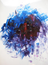
This is just one of the works in the museum. The story behind it is that Dali wanted to prove in front of an audience what a genius he is, and that he painted spontaneously and from insight (talk about modesty). What he did was he placed a live squid on canvas flat down on the ground. As the squid spilled its ink on the canvas, Dali moved it around with his feet and produced a painting of Beethoven.

This was the ceiling painted by Dali in one of the rooms in the museum. The main part of it is supposed to be his wife Gala and himself going up to heaven, representing that both of them will remain immortal through his paintings and works of art.
Wednesday 2 September 2009


Subscribe to:
Posts (Atom)